A letter, cut into three parts that still read as one.
Every application on this domain makes the same promise in software: separate, and still one system. The mark makes it first, in geometry.
The shortest true thing about the domain
Duknust is nine applications that refuse to merge into one. Floky doesn't know what Blobby holds; Blobby doesn't know what Preavis is tracking. Nothing is copied into a shared database, and nothing is quietly handed over to a common login screen either — an account signs into nine separate products that happen to open the same way and get read together, live, whenever something like 360 or SBS asks all nine the same question at once.
A wordmark can say that. It can't show it. So the mark doesn't spell out “duknust” — it's a single D, and the D itself isn't drawn as one shape. It's three: a stem, a foot, and a bowl, held apart by a gap just wide enough to read as deliberate rather than broken. Close up, it's three pieces. At the size almost everyone actually sees a mark — a tab, a home screen, a 16 px favicon — it's unmistakably one letter. That's the whole argument this domain makes about nine applications, reduced to a shape.
Not drawn free-hand
The proportions aren't a guess dressed up afterward as intention — the canvas itself is a golden rectangle, 1.618 (φ) on both sides, and every internal measurement answers to the one before it: a full unit, then half of it, then a quarter. Nothing on the sheet below is there to look considered. It's there because the shape doesn't close correctly without it.
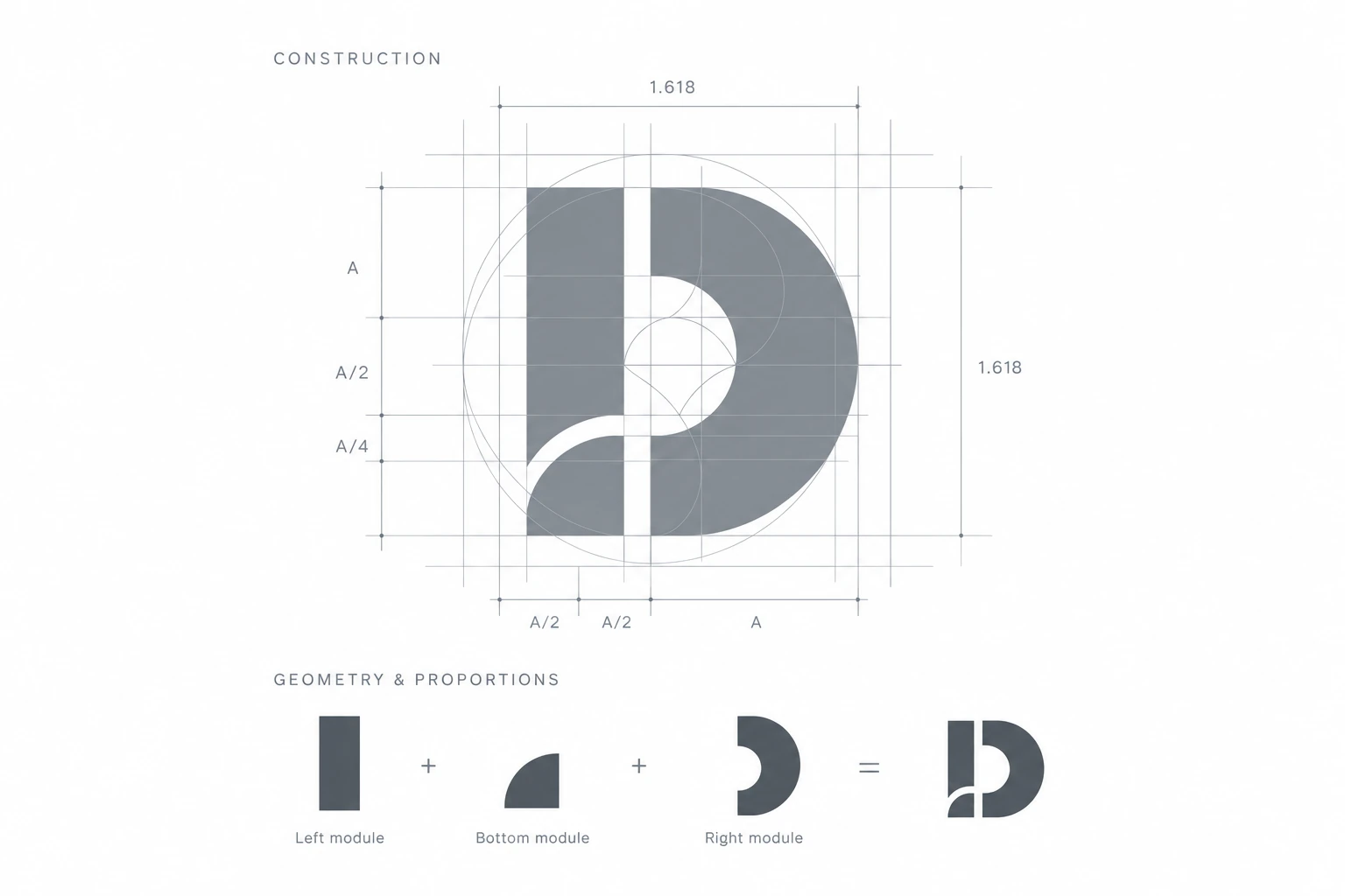
None of the three modules reads as a D on its own. Only this specific arrangement, at this specific ratio, does — which is the same thing the nine applications are betting on, one level down in the geometry.
Nine applications, the same discipline
Every application gets its own initial, built to the same rule the parent mark sets: modules, not strokes; a gap that means something; one colour, applied nowhere else. The colour is the fast read — which application, at a glance — the construction underneath is what keeps nine different glyphs from looking like nine different decisions.
Not every mark here is at the same point in that discipline yet — a few already carry it clearly, the rest are still catching up to it. The family gets closer to one shared construction language with each pass, not all in one release.
Where the discipline is still landing
The mark existing is the easy part. The harder, longer job is making sure nothing on the domain contradicts it — a stray colour, a leftover icon, a page that never got the update everything around it already has.
- Shipped
One accent per application — the same hue in its icon, in the relationship diagram, in every dot and stroke that identifies it. Unified across duknust.com and 360 this week.
- In place
The mark itself, on every icon a browser or a phone asks this domain for — favicon, tab icon, home-screen icon.
- In progress
The module-and-gap discipline carried into all nine application marks evenly, rather than the handful that already show it clearly.
- Not started
A small motion for the mark itself — the three modules finding their places once, on a first load, the way the landing page's own diagram already settles into position rather than arriving all at once.